Resume Design Style 21 Free Resume Creator
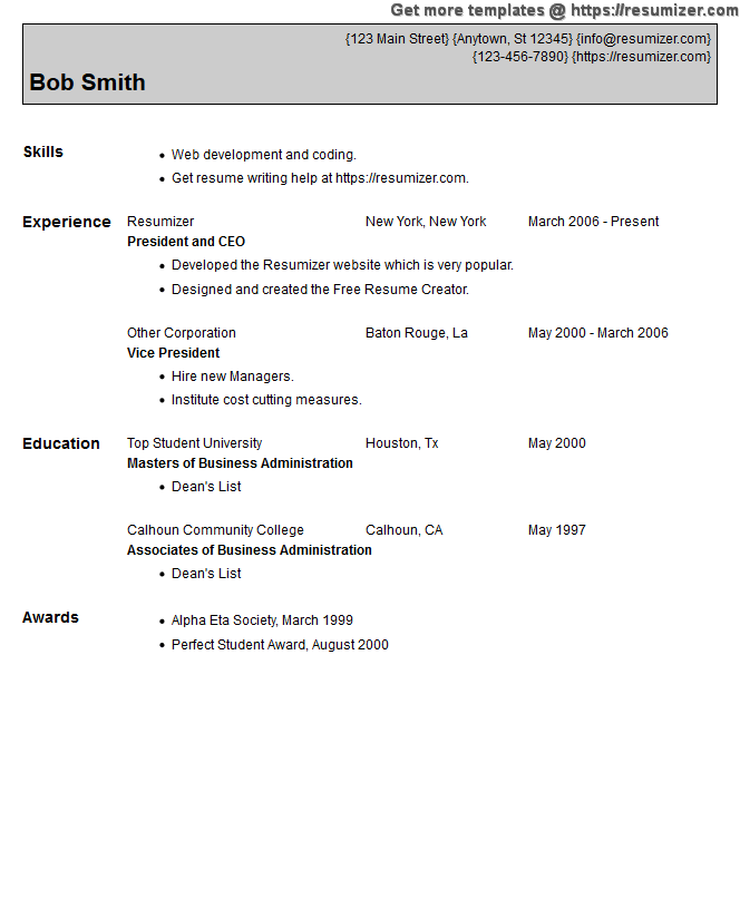
 Resume Design Style 21 has a nice top section for your personal info. It is filled in with the color of your choice and a thin outline. The rest of the sections have a clean, straightforward look.
The outline uses the same color as the text which ties it into the overall design. If you would like to have the outline only and no color for the top section, choose white for the accent color.
Resume Design Style 21
Aside from the cool look, this design is very compact. If you find that you need to put down many schools, many jobs or both, you will achieve a shorter page length as compared to some of our templates which have more space between the elements. Your name is displayed using a considerably large font, and the section labels are smaller with the rest of the content being even more modest. You can set the size of the font to adjust for page length and to make it more readable. There is a balance between the two; our default size should be satisfactory in most cases. If the preset size doesn't work for you, the Font Size setting is there if you need it.The nice curly braces surround the portions of your contact info to separate them. Both the Education and Experience sections have their first entries on the same lines as the heading labels. This configuration saves space without giving it a cluttered appearance; the difference in font size eliminates any confusion. If your school or company names are long, you may want to choose another style, so your info doesn't run together.
For more points to consider view our tutorial or read our template tutorial. If you would like to use this template you can download the .doc Word document and edit it with your word processor. You may also use it with our online creator as it is built-in to the program. Go to the creator by clicking the website nav button at the top, right.
TIP: If you arrived here from our creator's Style page and you want to use this style, please go back and continue using the program.
